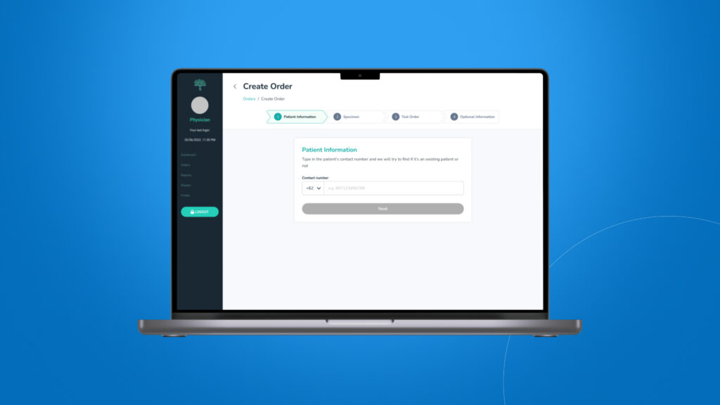
Personalized Medicine Report App
Responsible for simplifying the UX for users with non-medical backgrounds
Background
NalaGenetics was built with the passion to make preventive, DNA-based precision healthcare accessible to as many people as possible. This project involves a redesign of their pharmacogenomics report, aimed at improving user experience and streamlining the user interface for a cleaner appearance.
Project for
Nalagenetics
Role
UI Designer & UX Researcher
What is pharmacogenomics
Pharmacogenomics is the study of how an individual’s genetic makeup influences their response to medications. It explores how variations in our genes can affect how medicines are metabolized, their efficacy, and potential side effects. This field helps personalize medical treatment by tailoring medicine choices and dosages to an individual’s genetic profile, aiming for safer and more effective healthcare.
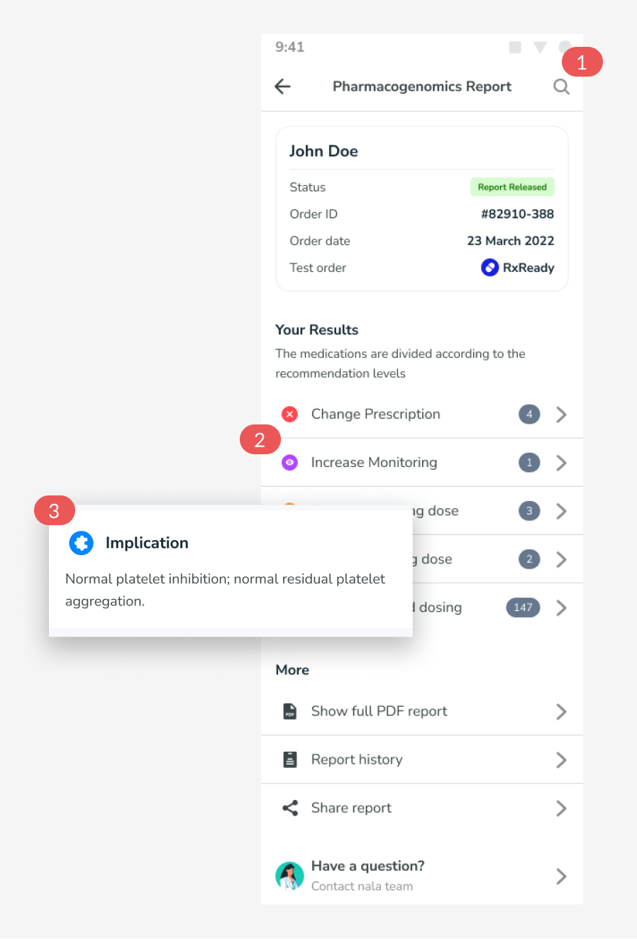
Previous design
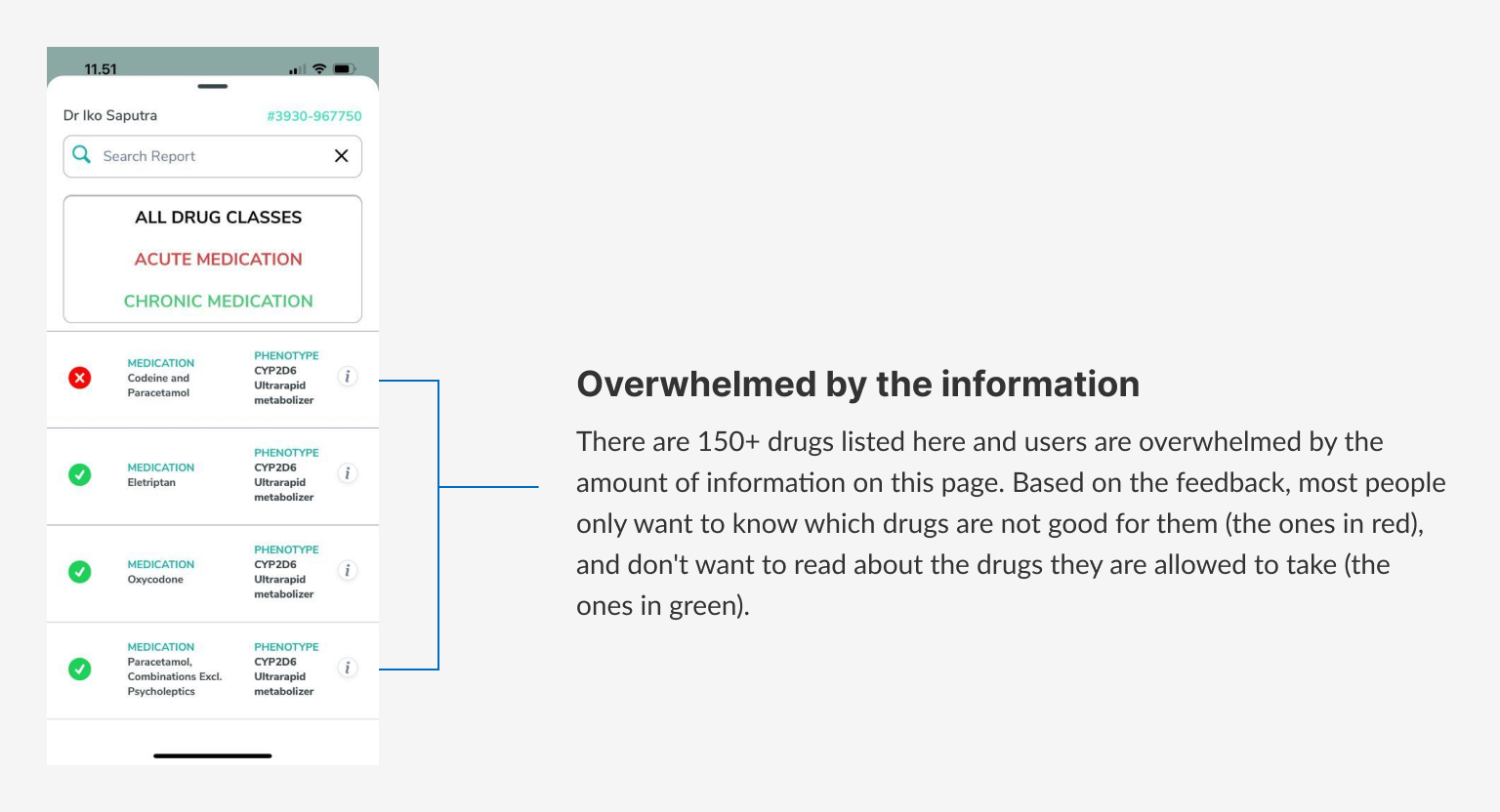
This is the design of previous pharmacogenomics reports. The task to redesign this report came from the product manager, we got a lot of feedback as the app was used by users.
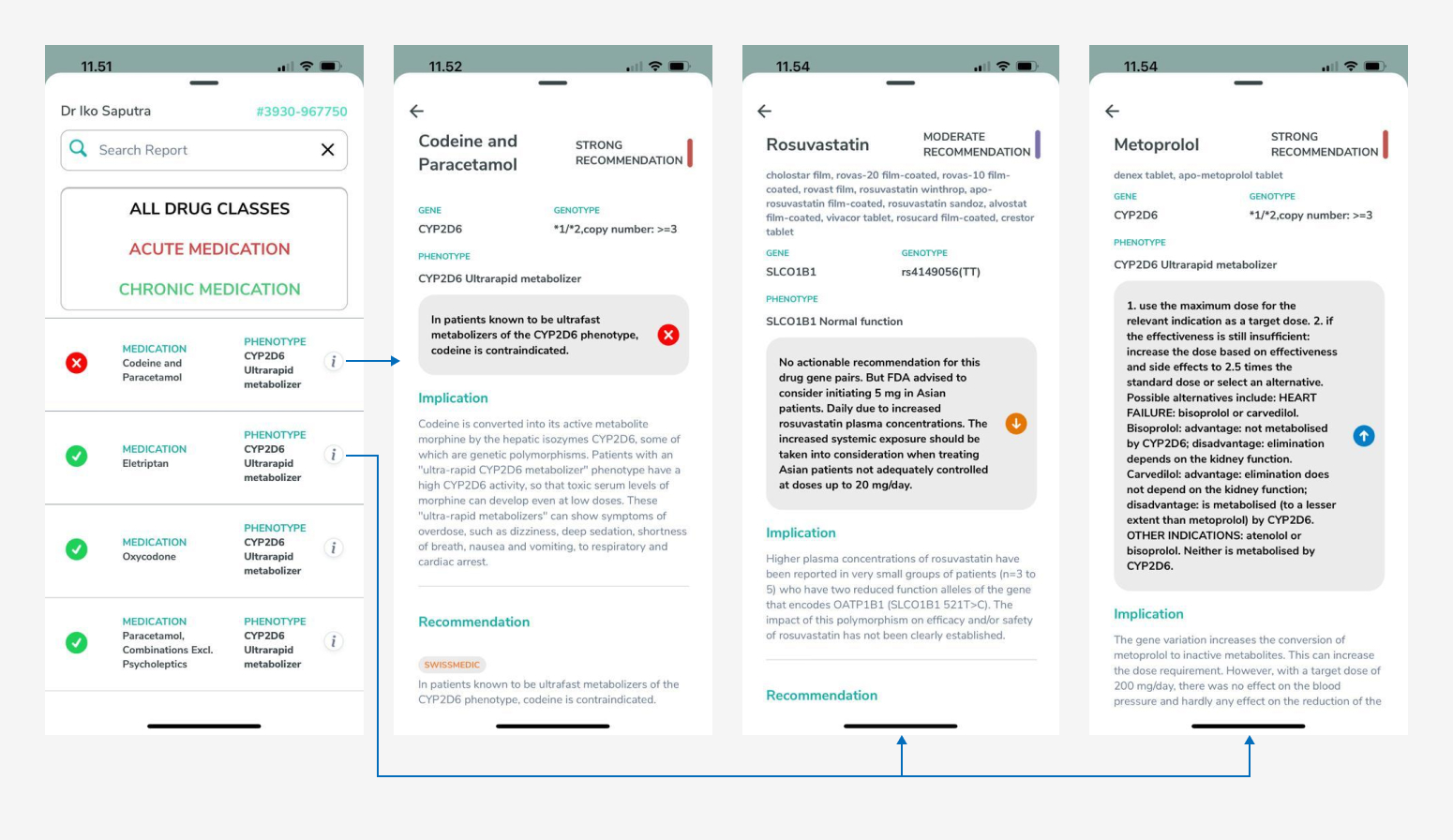
The problems
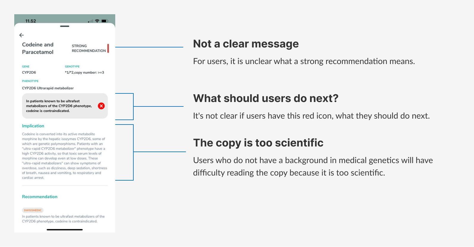
This is the problem pointed out by users. This is what users first see when they open the pharmacogenomics report page.
First mockup
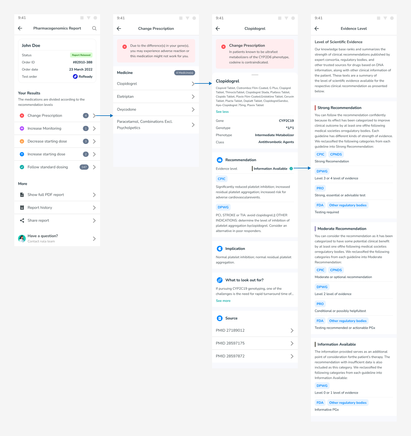
Based on the feedback given by our users, I tried to create the first mockup to solve all the problems.
I ended up sketching it in my notes first but lost it, so I’ll skip the wireframe process in this explanation.
Usability testing
We (Designers and Product Managers) invited 5 people from Nalagenetics who rarely open the app and look at pharmacogenomics reports. These participants may represent people who have never seen the app to avoid biasing the results.
Type
Qualitative Testing
Participants
5 people
Apps used

How we do the testing
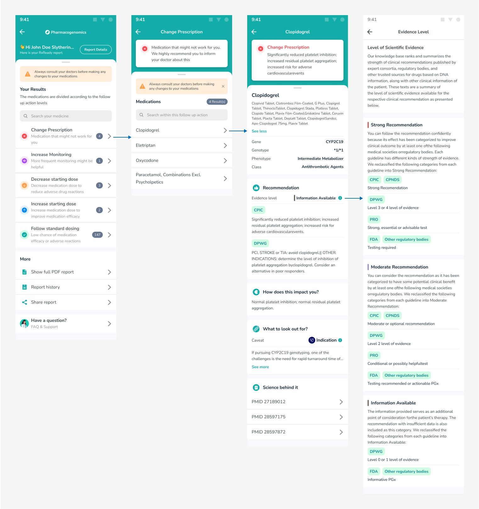
The interviewer gives the participants 2 missions using the maze prototype. After that, testers will access the Figma Prototype and be asked for feedback.
Questions we asked
After participants completed the mission and saw the prototype, we asked them a few questions.
- How was the overall experience?
- Which part of the flow do you not understand?
- Can you tell us what’s unclear, or what’s missing?
- Do you have any additional feedback?
- Are there any other questions?
What we tested
There are 2 flows to test :
- Please find your medicine details.
- Search for “Clopidogrel” inside the PGx report.
Testing results
1. Please find your medicine detail
All participants succeeded in finding the medicine details, but 20% of the mission was not completed because 1 participant accessed the medicine details using a different path. The misclick rate was high because participants always viewed the full report first and then accessed the medication details. They say it’s fun to explore other things first before looking at their report.

2. Search for “Clopidogrel” inside the report
Not all participants could find the search button, apparently, the search button in the top right corner was less visible to the participants.

Feedback
- Search icon on the PGx report page was hard to find.
- A bit confused when saw “Your Results” section at first glance (don’t know what change prescription or other recommendation categories means).
- It’s hard to understand the report because the text is too scientific and hard to understand from a user without a medical background.
- Make the color scheme more Nalagenetics.
Final mockup
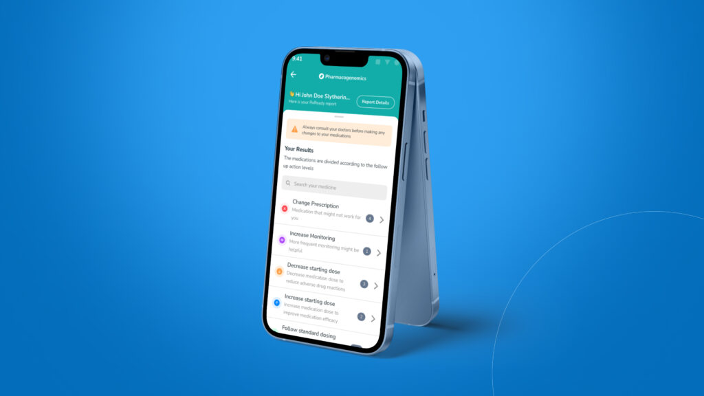
After we discussed how to solve all the problems from all the input, here is the final mockup.
What’s changed
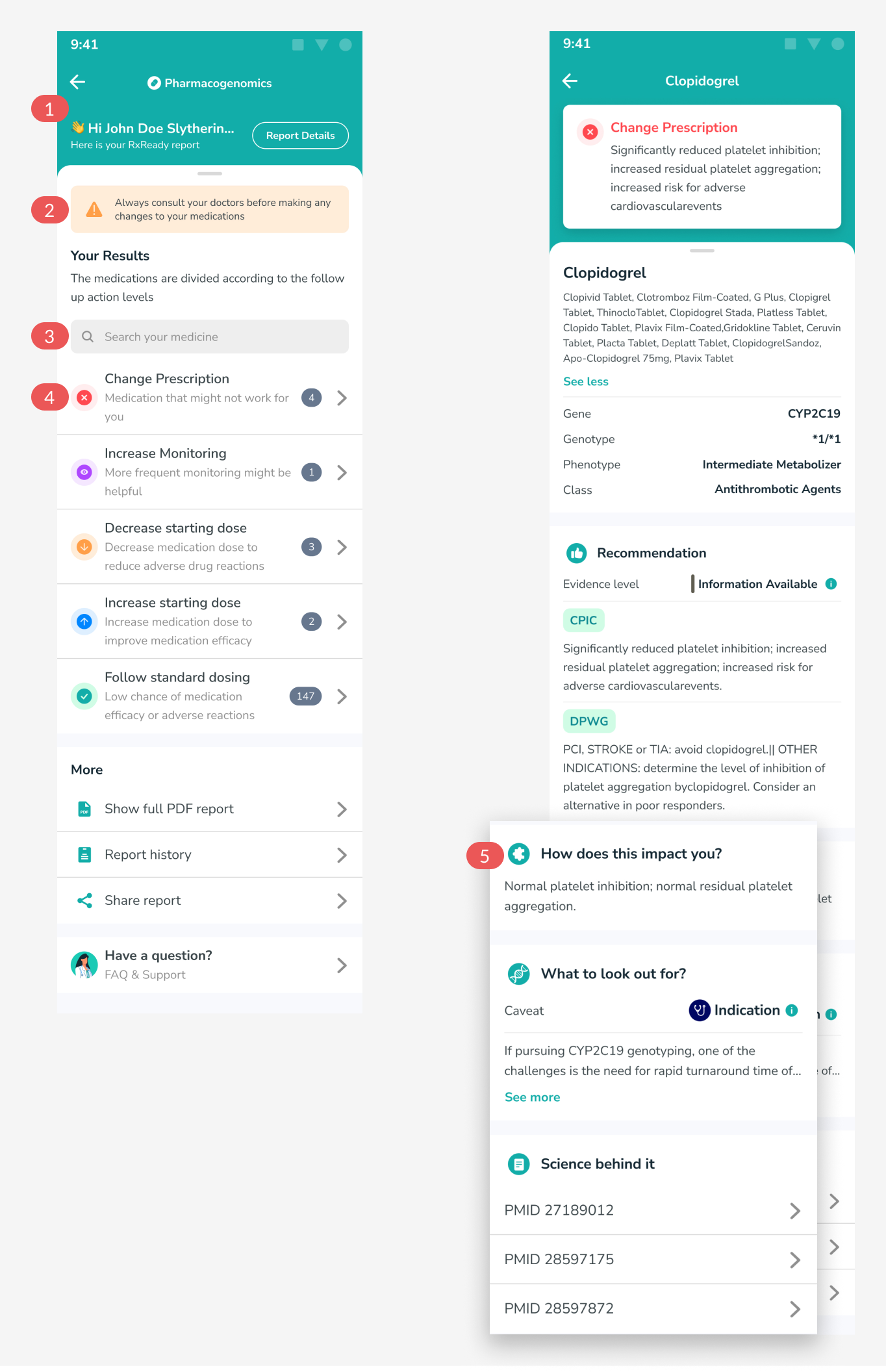
- Changed the color scheme to green to match Nala’s color scheme.
- Because all recommendations are suggestions and users should always consult their doctor, that’s why we added this.
- Moved the search button from the top right corner to the above recommendations because we realized that the search button is important for searching for any medicine.
- Added a description to each recommendation to explain more about what it is.
- We changed each card title to make it easier to understand.
What can be improved next
Unfortunately in this iteration, we couldn’t change the copy to be less scientific because it would require a lot of effort from the knowledge base team to change 150+ medicines, so we hope in the future we can change this copy.
We hope to have tracking software to help us collect more data once the design is deployed to production.
