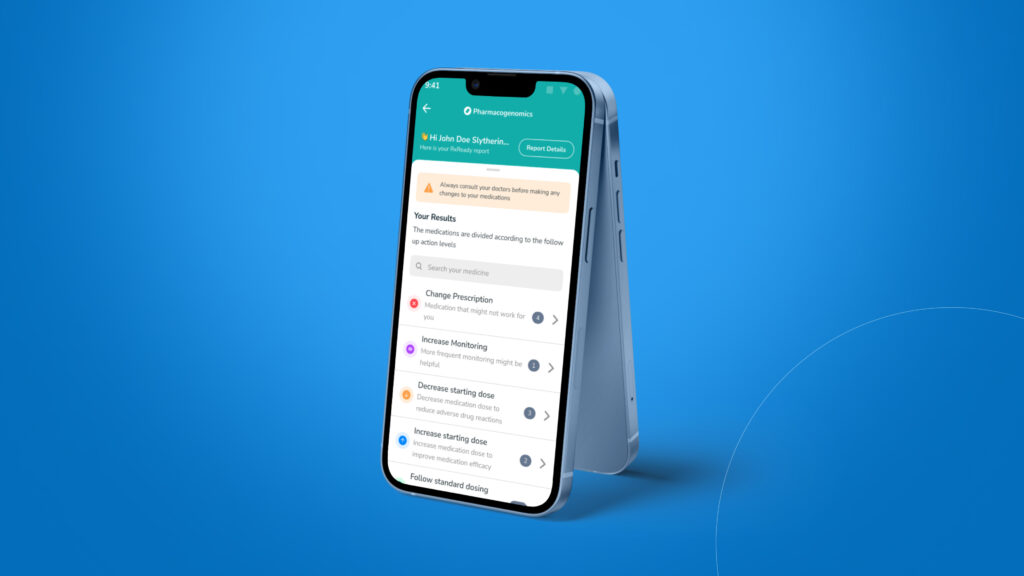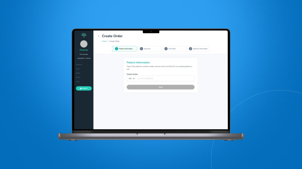
Order creation for dashboard
Research, Design, and Usability Testing to enhance order creation experience
Protected ![]()
Background
This project was initiated by me because creating an order is an important part of converting users into customers. The main goal of this project is to dig deeper into user pain points and make order creation easy and fast.
Project for
Nalagenetics
Role
UI Designer & UX Researcher
Context on what to redesign
There were already some pain points presented to the product team but we wanted to make sure if there were any other pain points that we weren’t aware of, so we decided to do qualitative testing.

User research
We invited 3 people from Nalagenetics who use the dashboard as a daily task to create an order.
Type
Qualitative Research
Participants
3 people
Apps used


Findings
- There are cases where the whole family wants to order and the user only uses 1 email to order because their child doesn’t have an email.
- When creating a new order, no information is provided whether it is a new patient or an existing patient.
- Users never use order progress.
- Patient details are the most difficult part to fill in because there are too many columns to fill in.
- Users open 2 windows side by side when entering data.
- Test orders are not grouped making it difficult for users to find the SKU.

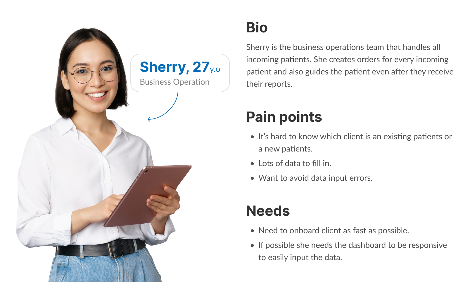
Persona
Proposed user flow
Here is the user flow to resolve all issues. The main focus of this solution is to reduce the length of each page and create multiple steps. By dividing it into multiple steps, users will not be overwhelmed by the amount of data that must be filled in.

First Iteration
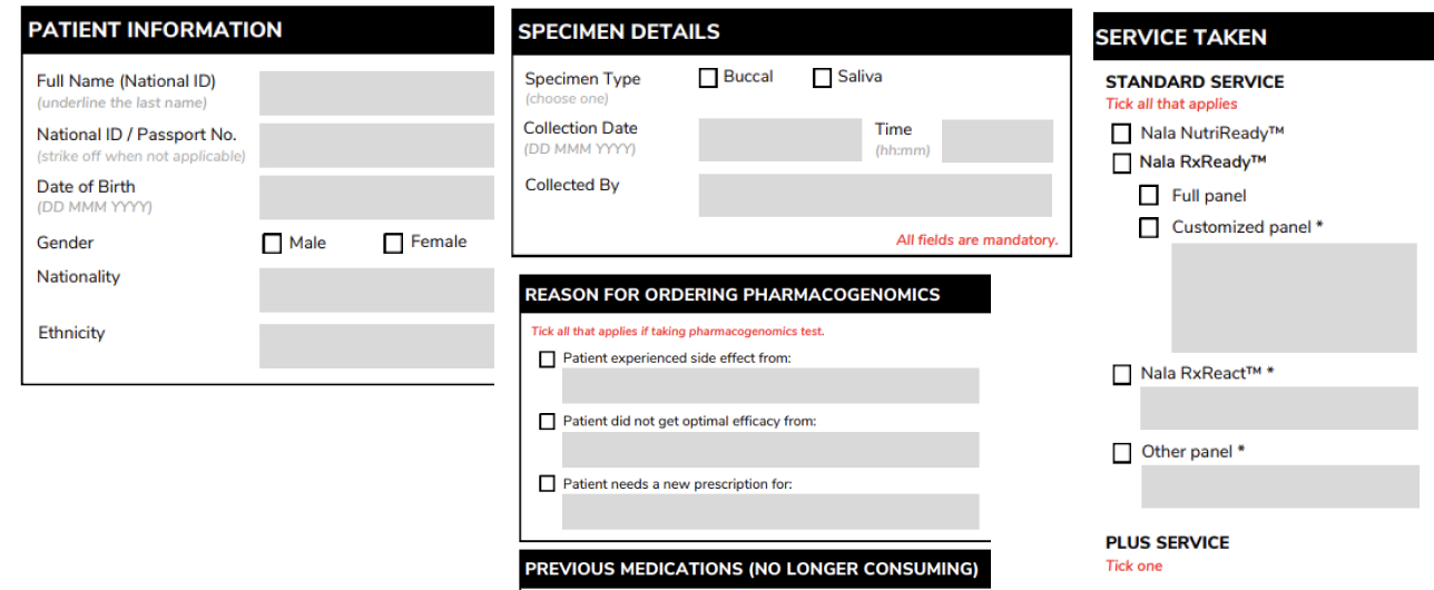
After making a few sketches in my notes, I decided to get straight to the solution. I divided it into 4 steps, according to the test request form, to make it easier for users to enter data.

1. Existing Patient vs New Patient
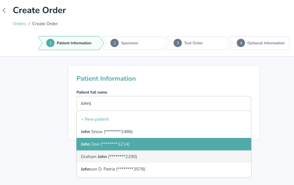
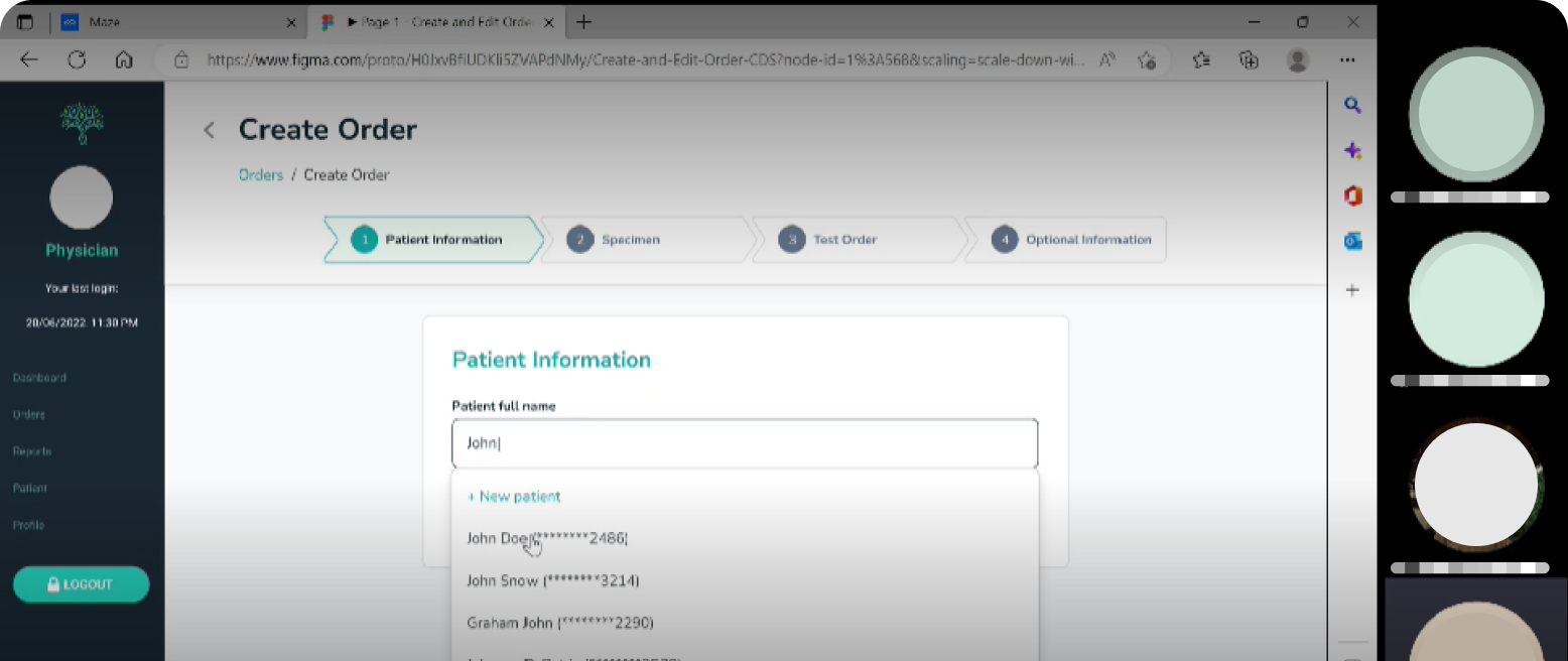
To solve the problem where the user doesn’t know if it’s a new patient or an old patient, I decided the user should enter the patient’s full name first and then select it, if it’s not in the dropdown then that means they need to create a new patient record. We also add the last 4 digits of the phone number to indicate that it is the correct patient.
2. Patient Information
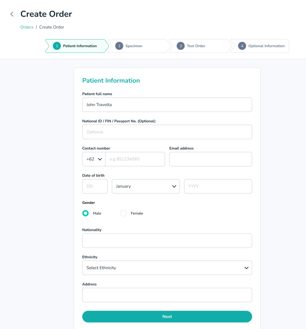
We removed many columns like country, city, state because they are not used by anything to reduce the number of columns to fill in.
3. Specimen
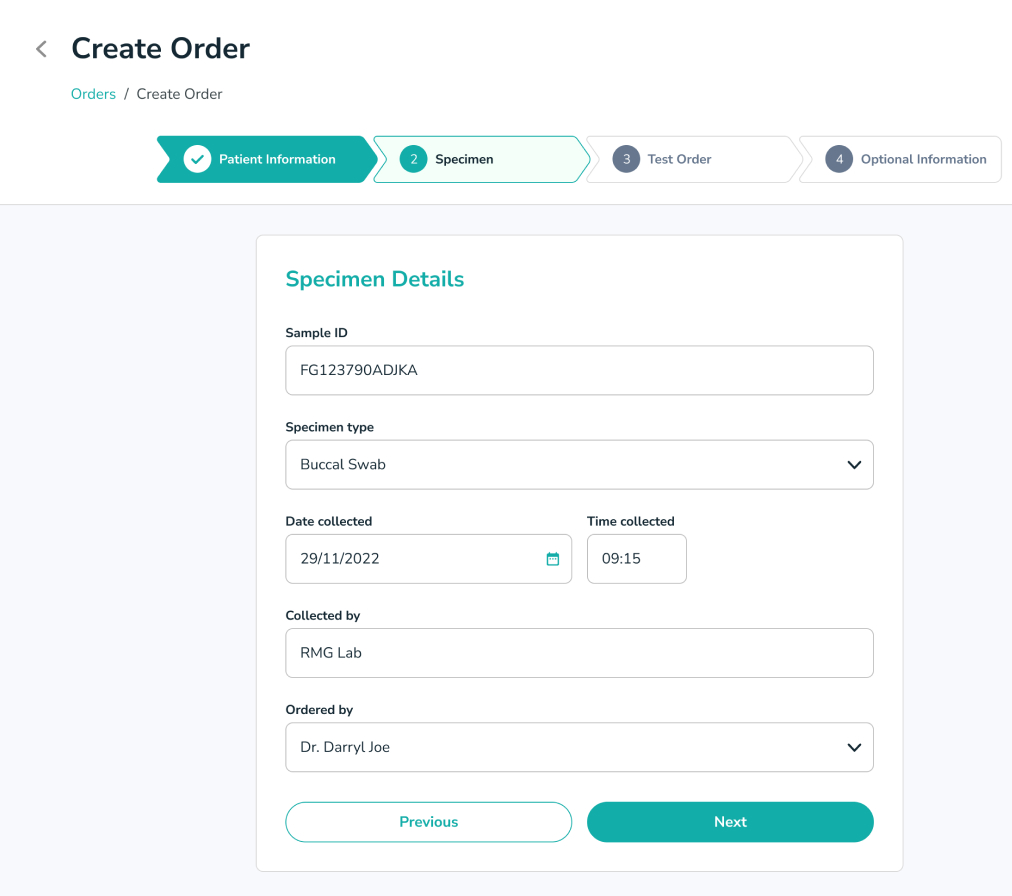
Users only need to fill out this form based on the physical form they receive.
4. Test order grouping
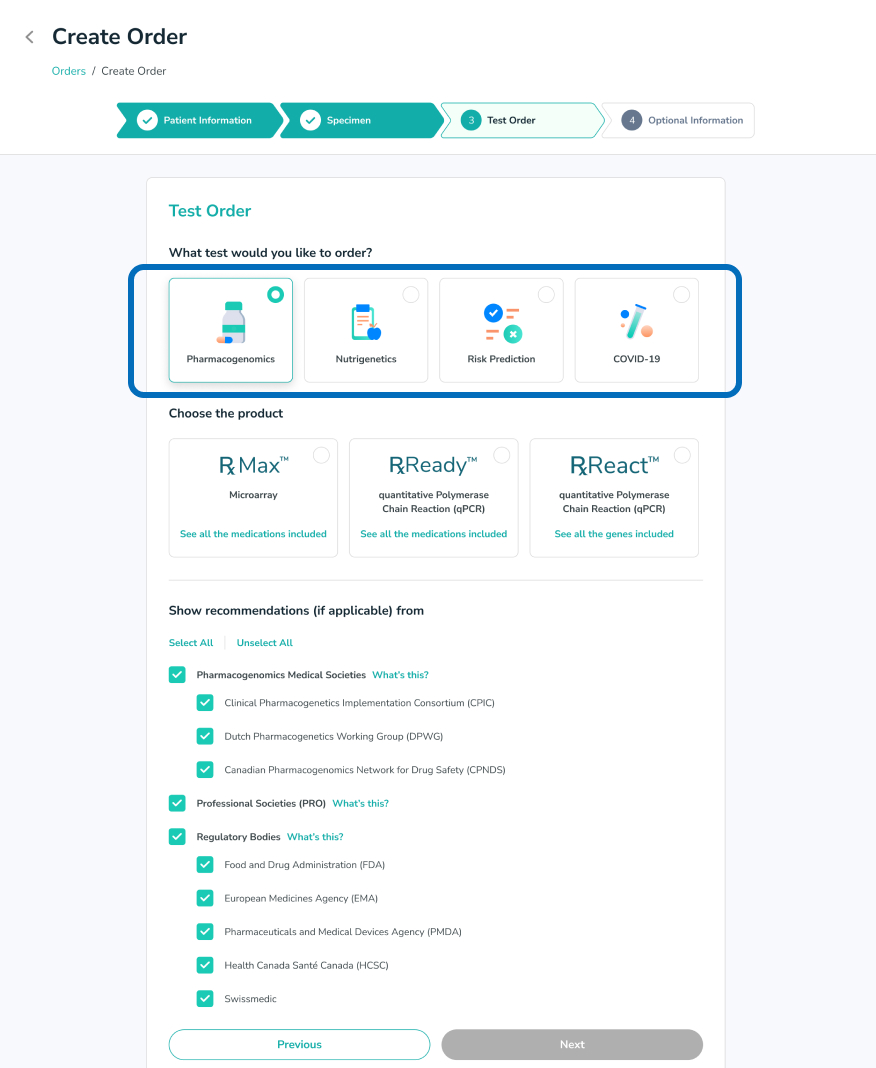
I grouped the SKUs so they weren’t too long and made it easier for users to choose if we limited their choices.
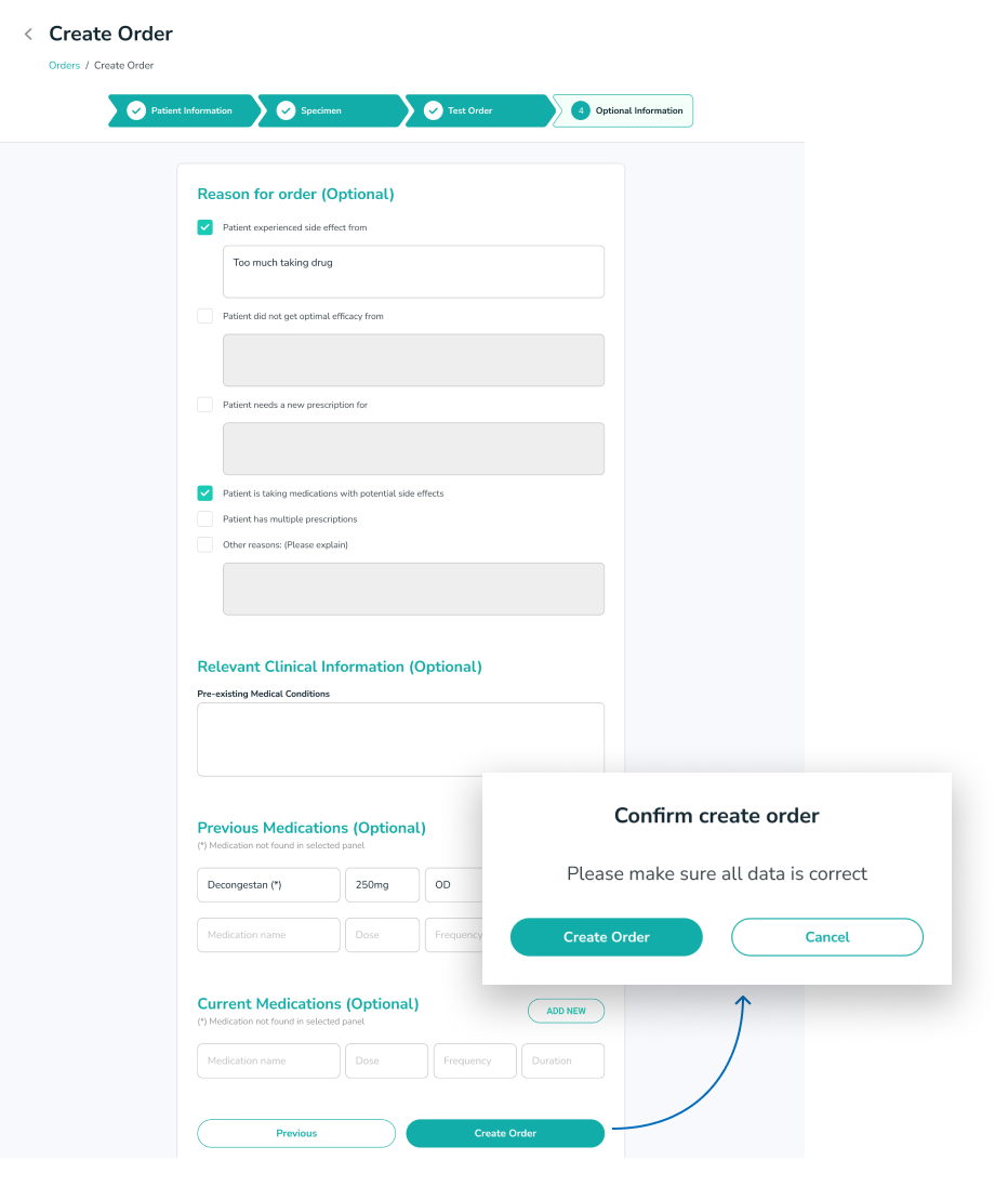
5. Additional Information
Here I put all the optional forms so if the user doesn’t have this data in physical form, they can skip it.
I also added a confirmation pop-up and told users to check their data one more time before clicking create order.
Usability testing
We invited 6 people from Nalagenetics, 3 of whom we invited in the previous user research stage to get their input and we also invited more people who often use the feature.
Type
Qualitative Research
Participants
3 people
Apps used

Summary
6/6
Completed the test
6/6
Said it was easier than before
5/6
Confused on the first page
Findings
- Users ask whether on the first page they need to fill in old patients or new patients.
- Users are confused about what (*****2461) on the first page means.
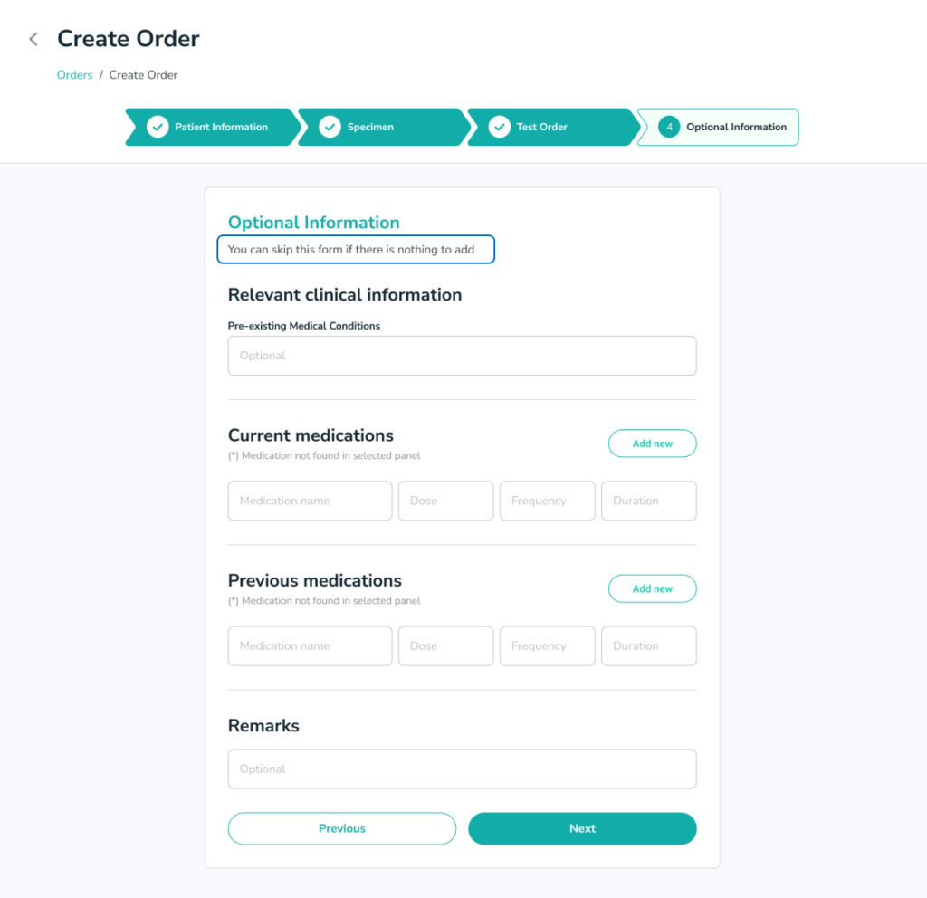
- On the Additional Information page, users don’t understand whether it can be skipped or not.
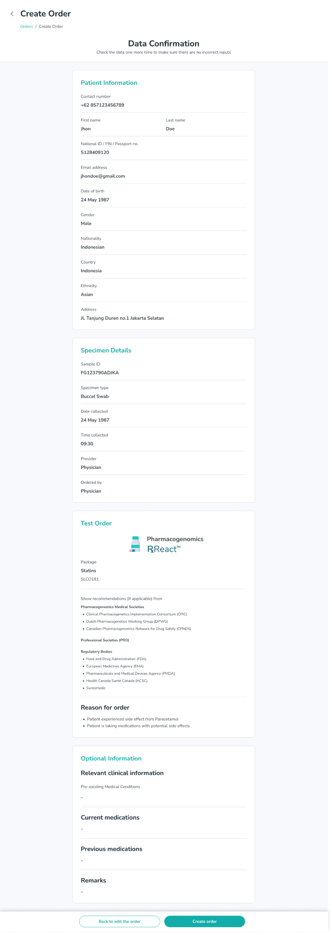
- They want a confirmation page that displays all the data they have entered to minimize input errors and not just a pop-up.
The challenges
- It turns out that Singapore has a PDPA law that we must comply with, to use this approach we cannot display all patients in our database, we can only display patient data in the laboratory they are logged in to. As a result, we will duplicate patient X’s data in Lab A and Lab B.
- We also can’t display the phone number when the user types any word, because if we allow that then the user can type a random word and find any patient information.
- The backend cannot display data every time the user types a word because it would require a lot of resources to fetch the data from the database and then display it in the dropdown.

The solutions
- We agree that it is OK to have the same patient data but in different laboratories.
- We convert full names to phone numbers because they are unique for each patient.
- The user needs to click next and If the patient already exists then the user has to select which patient is ordering, this way the backend does not need to constantly search for data every time the user types a word.
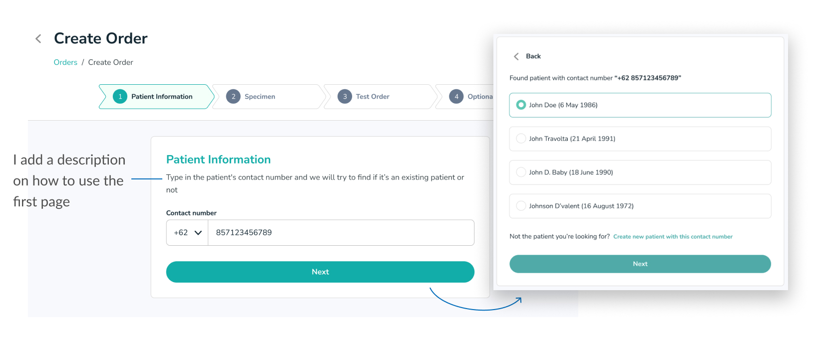
What’s changed
I added some description below the page title to indicate that users can skip the form if there is nothing to fill in this form.
I added a confirmation page for users to check the entered data and reduce input errors.
Survey feedback
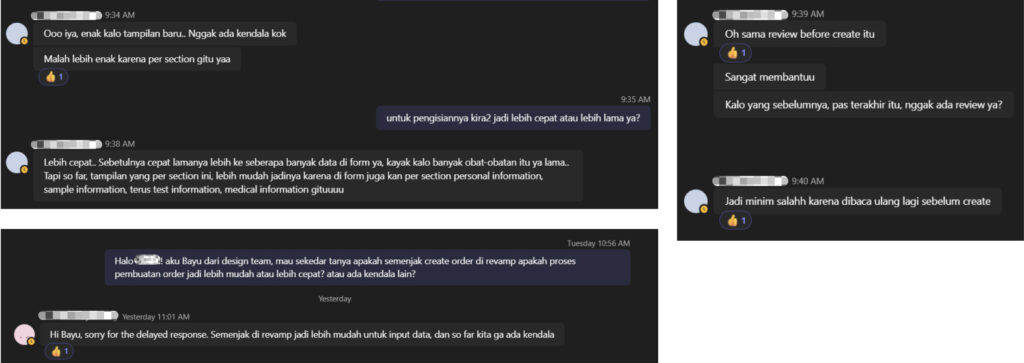
I did a small survey of 2 people from the internal team after the order creation feature was deployed to production. These 2 people use the order creation feature every day.
🏆 Summary of feedback
Easier to input data & data confirmation helps a lot to review all entered data
What can be improved next
The survey said it did help users after improving the design, but to get real data, it would require some tracking tool to actually observe if users opened certain pages or experienced difficulty on certain screens.
So in the future we hope to be able to install tracking software and also do qualitative research on each user to really validate the design.
